Project
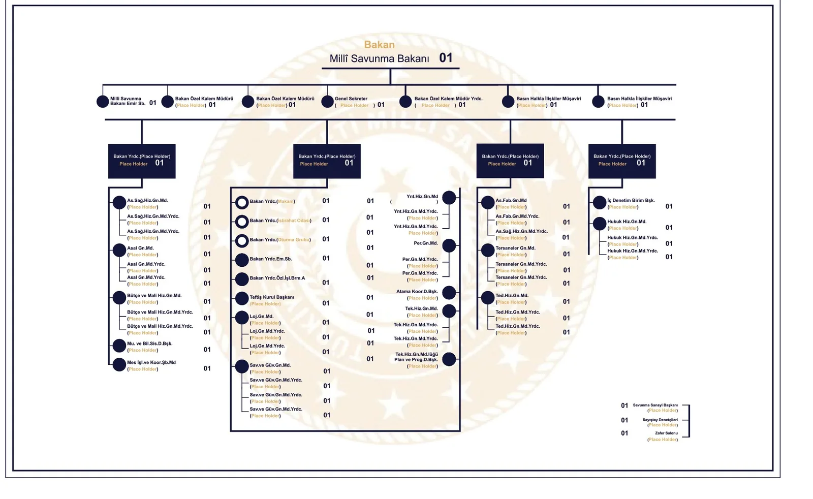
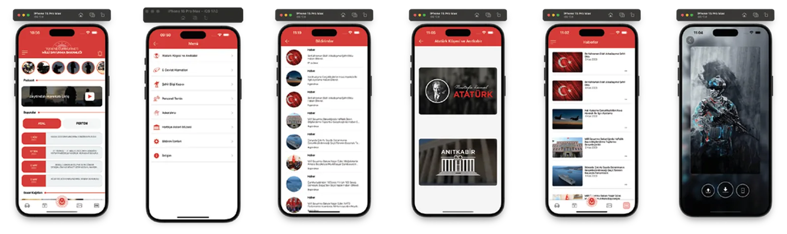
A content-heavy corporate app needed a single, consistent interface system, and a multi-level phone directory needed an easy-to-read layout.
Process
The home, menu, news, gallery and media screens of the mobile app were designed within a single interface system tied to the organisation's identity, with colour, typography and icon language shared across every screen. For the phone directory, the multi-level hierarchy was turned into a legible organisational chart in which any unit can be found quickly.