Project
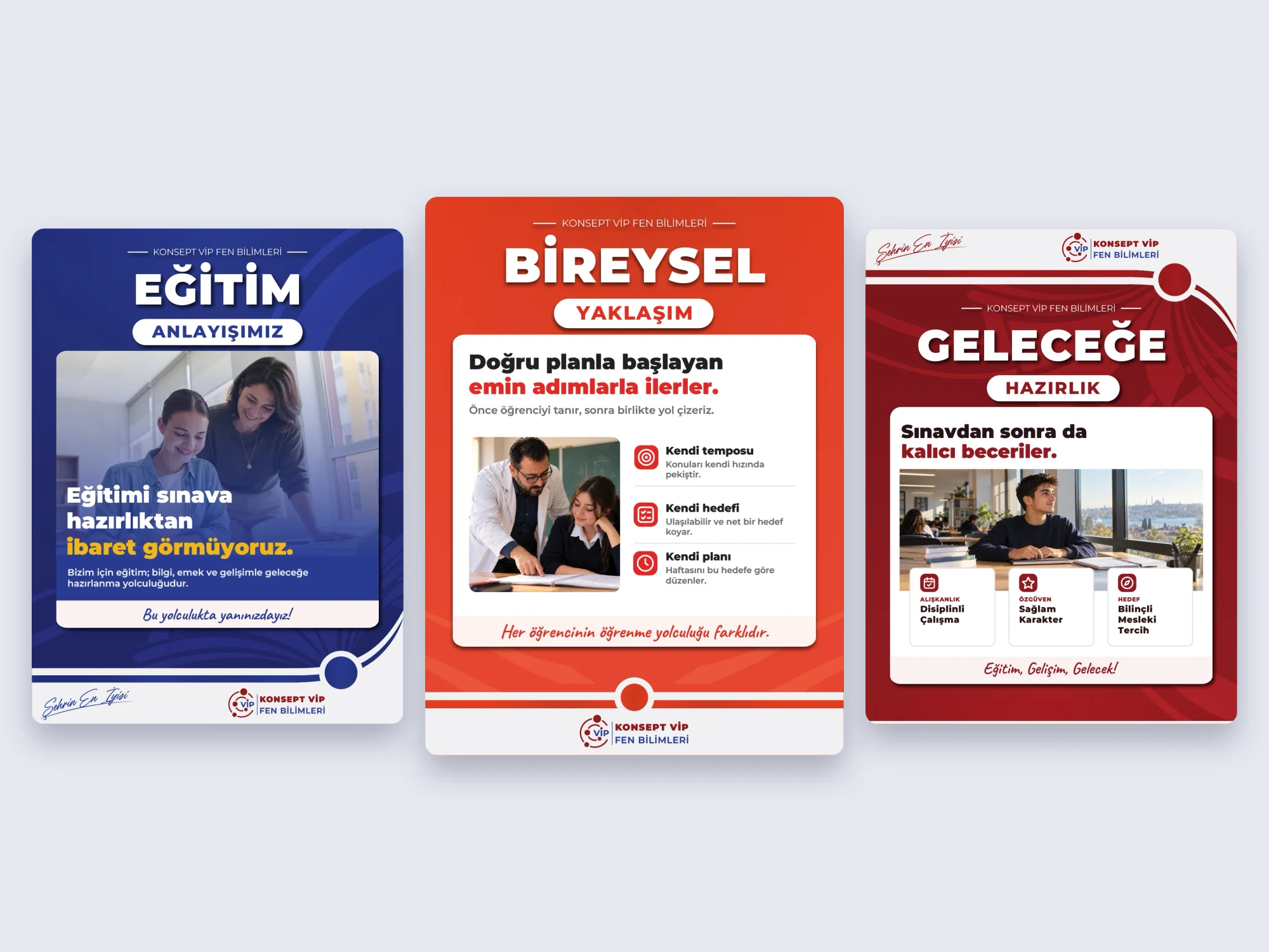
The school needed post templates that explain its approach, values and branches, each readable on its own and reusable for new content.
Process
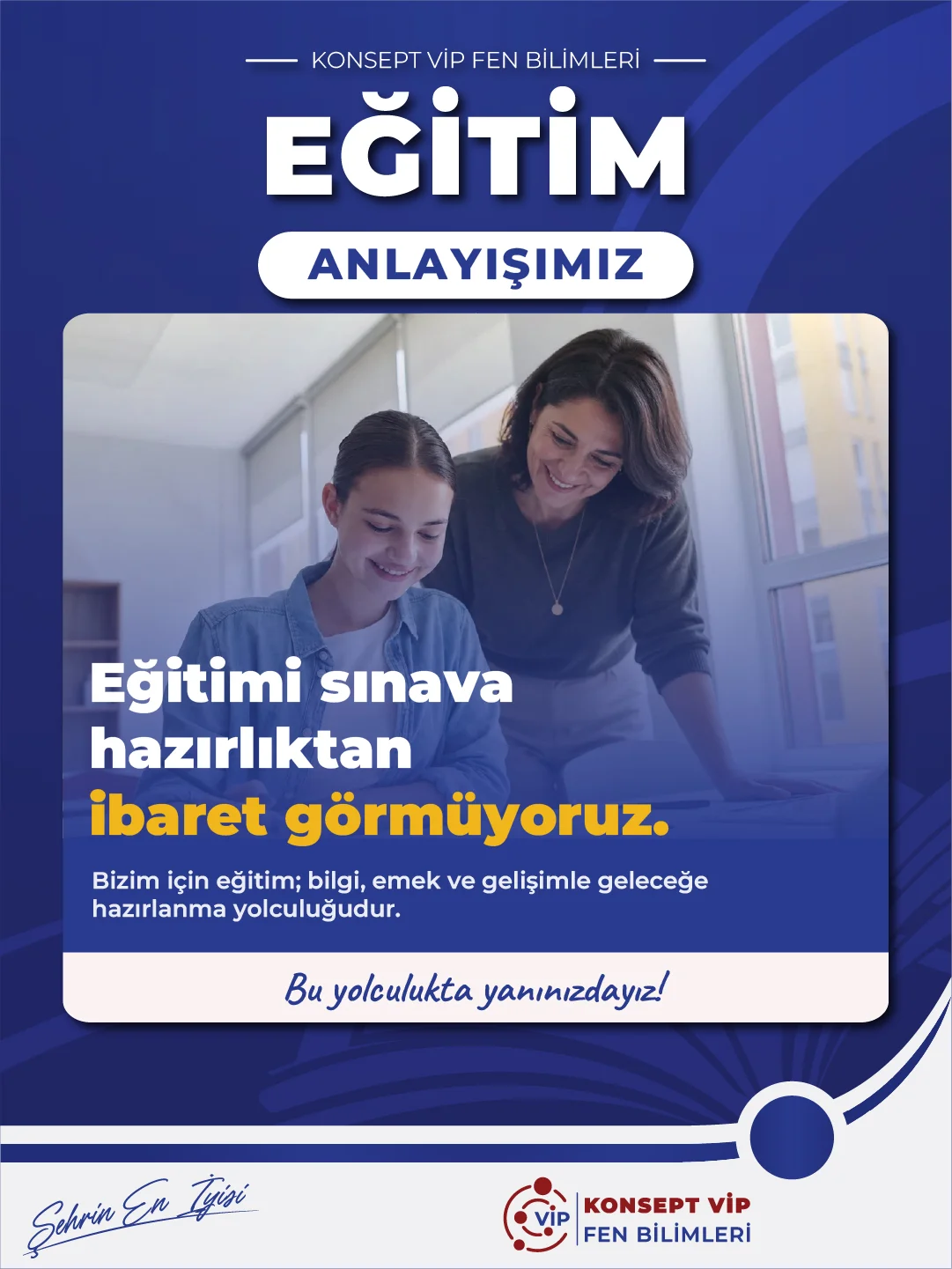
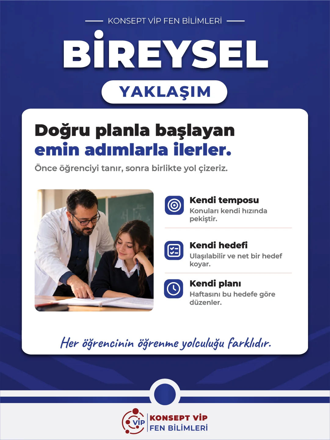
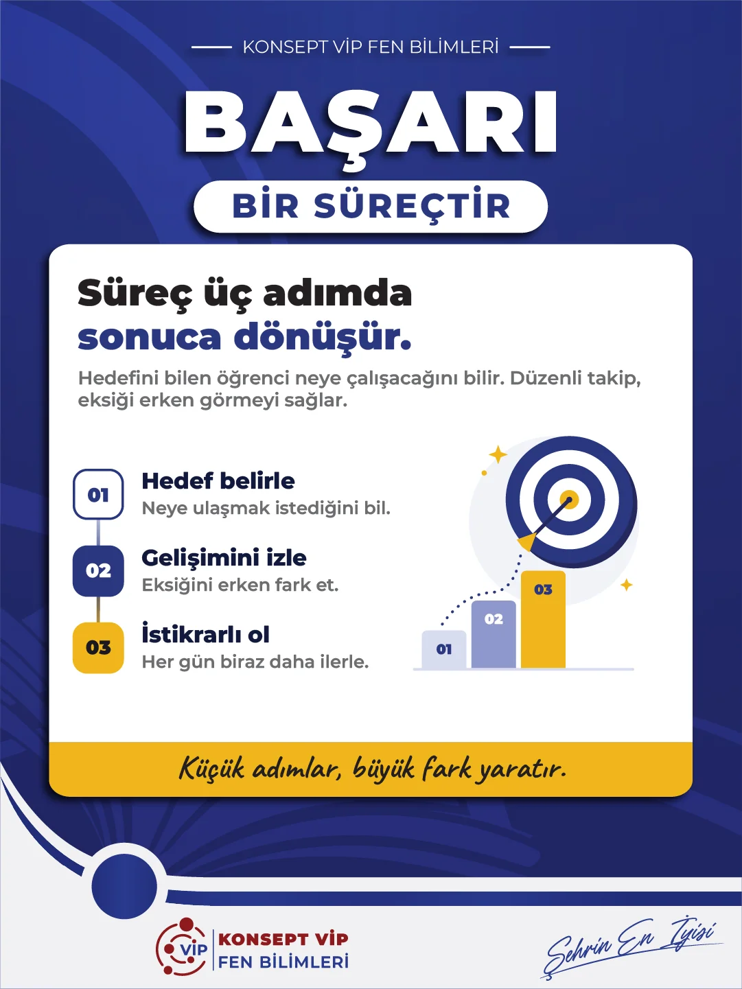
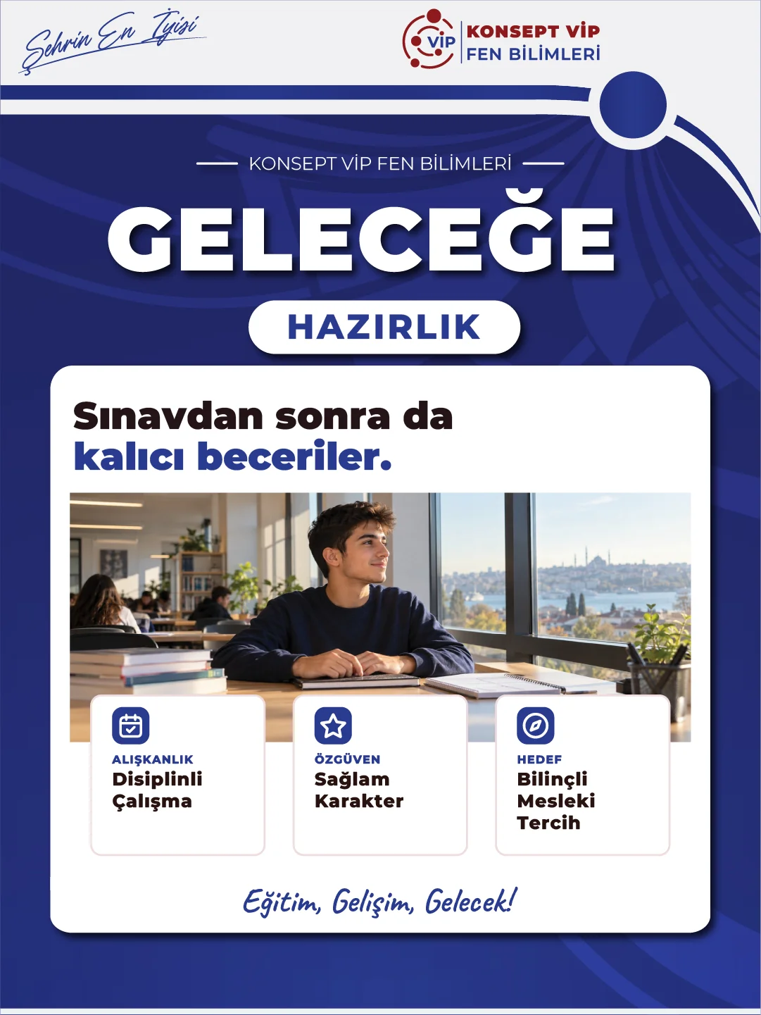
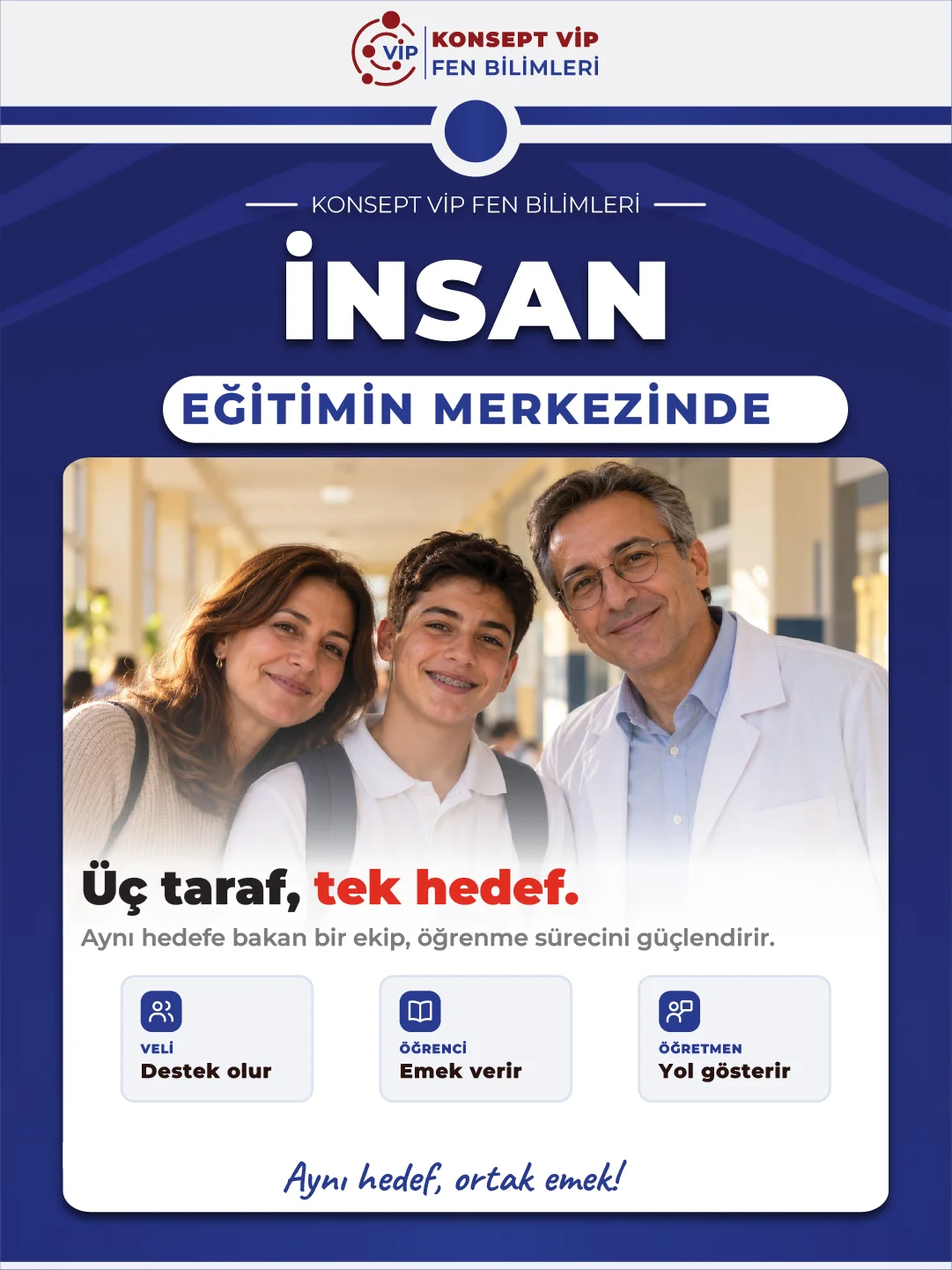
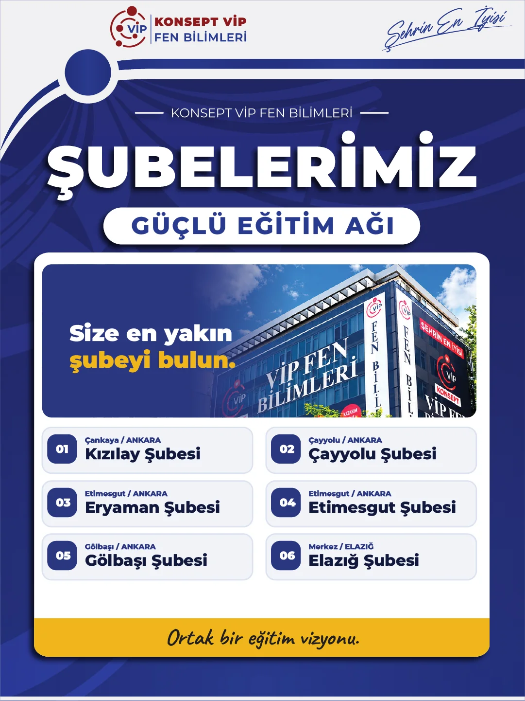
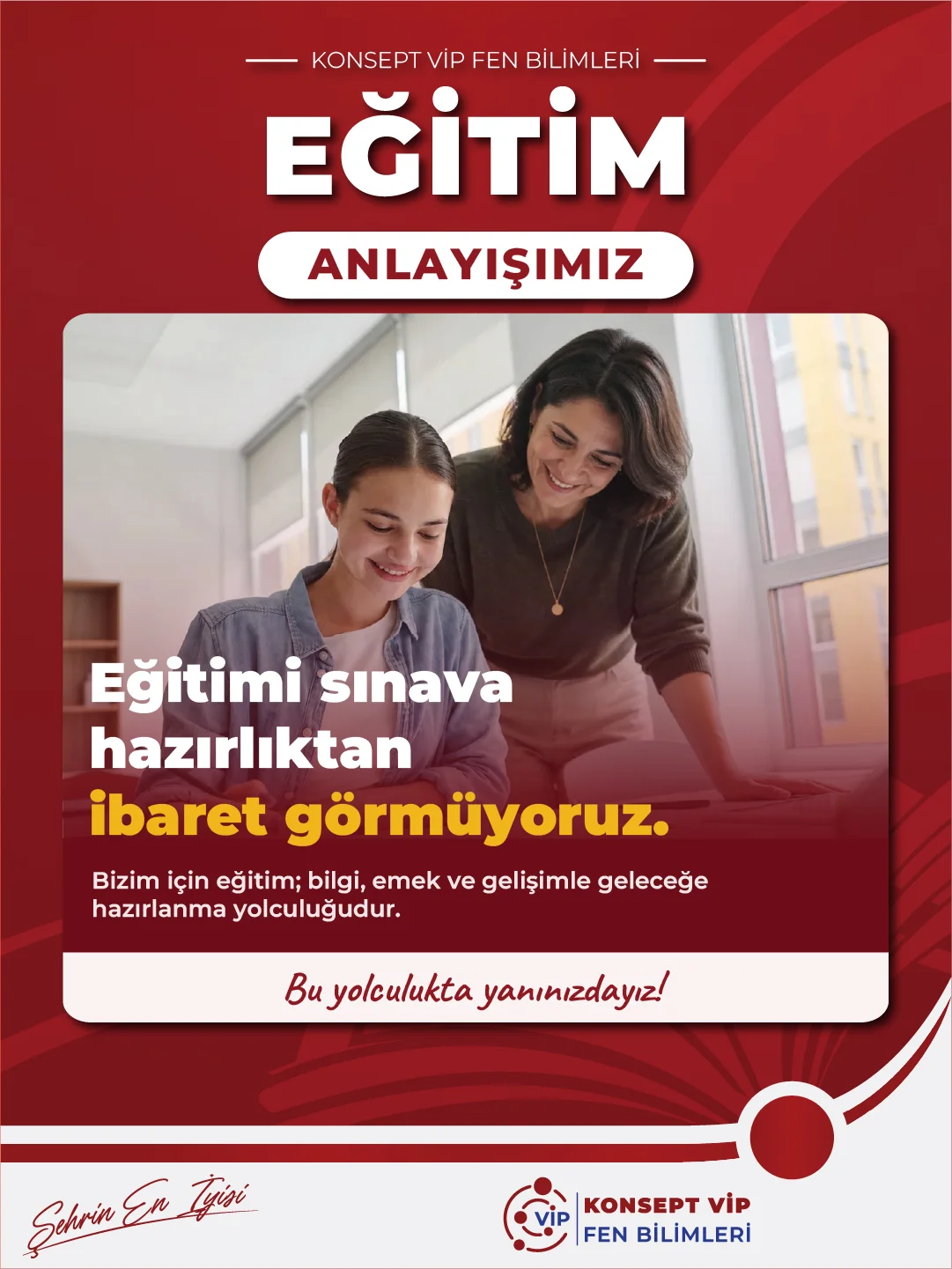
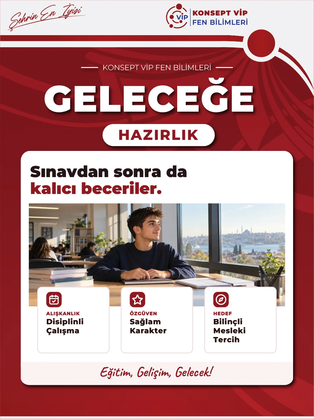
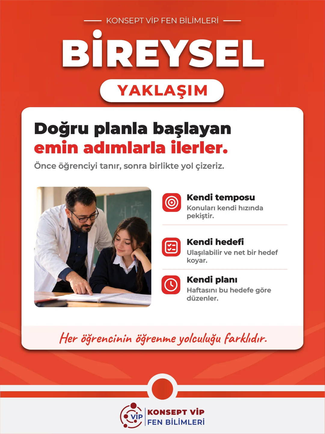
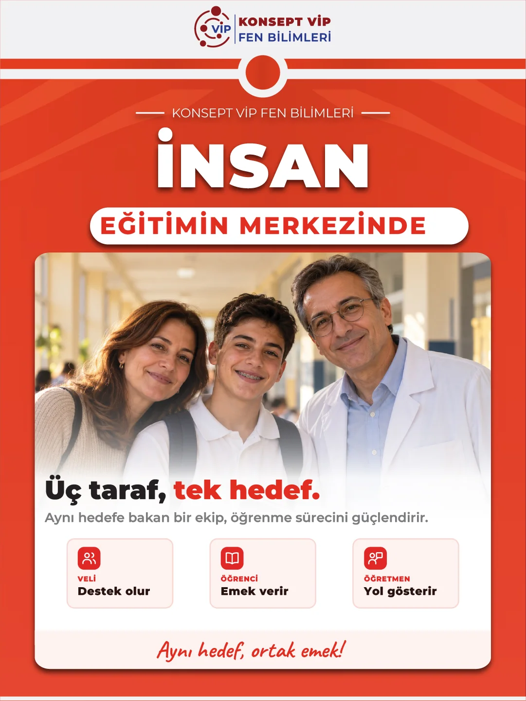
Every post sits on the same skeleton: a large headline, a pill-shaped subheading, a white content card and a handwritten slogan band at the bottom. The card changes with the topic: text over a photo, an icon list, a step-by-step process or a list of branches. New topics can be turned into posts quickly within the same layout. The colours come from the brand's navy and burgundy identity, with orange and red versions added for the branch account.